Rapid eLearning
58.2K views | +0 today
Follow
Rapid eLearning
Création rapide de contenus eLearning
Your new post is loading...
Rescooped by michel verstrepen from Business and Economics: E-Learning and Blended Learning
Scoop.it!

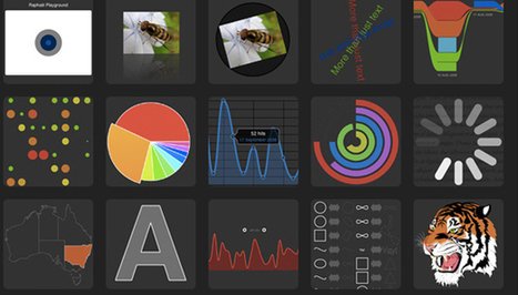
The top 20 data visualisation tools

The top 20 data visualisation tools | Rapid eLearning | Scoop.it

From simple charts to complex maps and infographics, Brian Suda's round-up of the best – and mostly free – tools has everything you need to bring your data to life...

A common question is how to get started with data visualisations. Beyond following blogs, you need to practice – and to practice, you need to understand the tools available. In this article, get introduced to 20 different tools for creating visualisations...


Via Lauren Moss, Baiba Svenca, Jenny Pesina
Randy Rebman's curator insight, January 28, 2013 12:33 PM

This looks like it might be a good source for integrating infographics into the classroom.

Rescooped by michel verstrepen from visual data
Scoop.it!

How To Design Your Own Infographics...

How To Design Your Own Infographics... | Rapid eLearning | Scoop.it

Infographics seem to be a real trend today, with new ones popping up daily on all sorts of subjects. From mortgages to ice cream, estimating software to infographics about infographics, there is very little now that hasn't been 'visualised' in some form. Many people don't realise that the term information graphic, or 'infographic' was first coined over 100 years ago, with the Coxcomb chart by Florence Nightingale in 1857 being one of earliest recognised examples. They have existed in many forms since then, but only in the past few years have infographics developed into the art form we know today.


Via Lauren Moss
No comment yet.